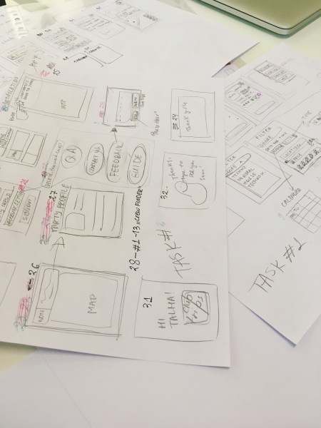
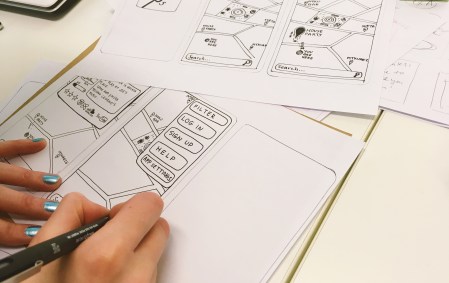
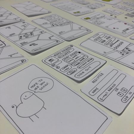
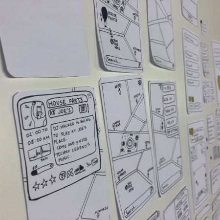
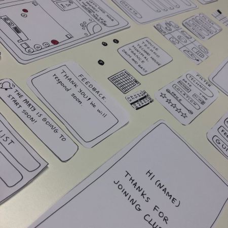
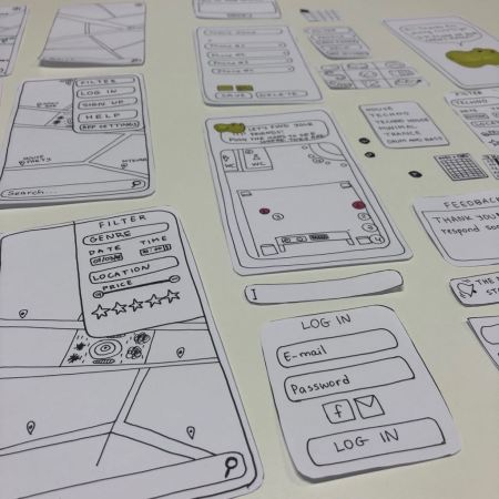
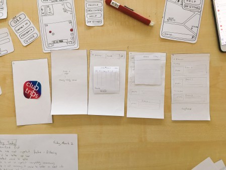
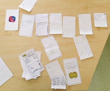
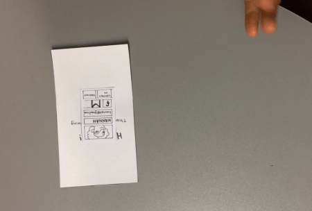
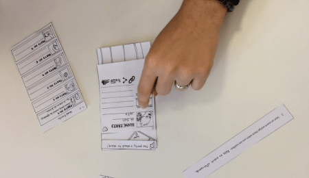
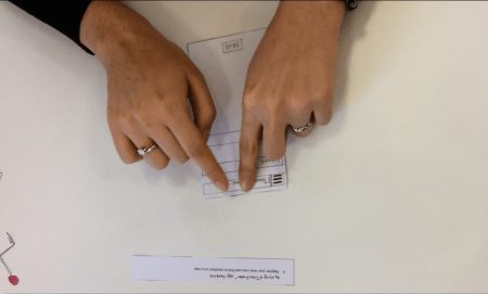
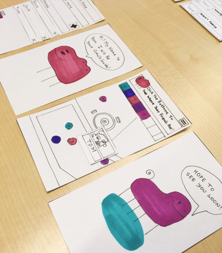
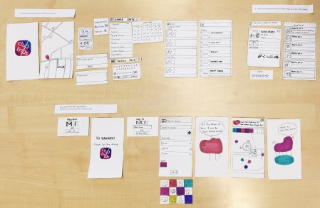
Paper Prototype
Testing of ClubTrips’ Paper Prototype

Test No.1:
Testing Tasks:
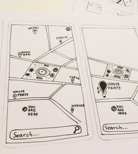
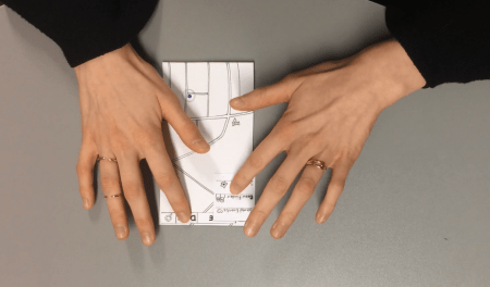
- Filter and pick a house party playing techno music on the map.
- Save an event and go there when you get a notification and give feedback to the party if it is necessary (by using a “Help” button).
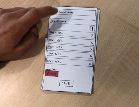
- Register and find your party crew members.
Issues:
Search button was a preferred choice for users.
- Filtering - which was an important part of an app was hidden and hard to find.
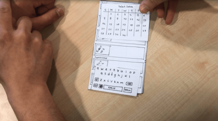
- The need for the time option, event price, and user’s birth date was unnecessary.
- The titles, text input, and other buttons looked similar.
- The necessity for registering had to be limited.
- Only Facebook and Gmail input for registering would be enough.
- The “Sign out” button had to be hidden.
- Questionable place and need for Feedback or Report button.
- An order in which the “Settings” were designed had to be overlooked.
- Ranking should be on a “Feedback” page (if there is one)
- The “Menu” bar was missing (was not clear).
- The function for registering the users had to be overlooked (Bluetooth might not be an option)
- Emojis and colors could be combined.
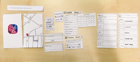
Test No.2:
Changed testing tasks:
- Find a house party nearby that plays a techno music on Dec.18
- Save an event and go there when you are notified.
- Register your new crew and find its members on a map.
Issues:
- In “Search” was used differently than expected, especially when the date of an event and “Crew Finder” was typed.
- On the paper prototype, it was unclear how to make some screens disappear.
- The user was not briefed about the ClubTrips app, that is why it was difficult to understand the term “new crew” in the Task 3.
- In “Crew Finder” screen prototype, the usernames had to be separate papers for a better understanding of a process.
- When pushing the buttons on a map to see the friends, it would be nice if you could see their profiles (nickname + photo)
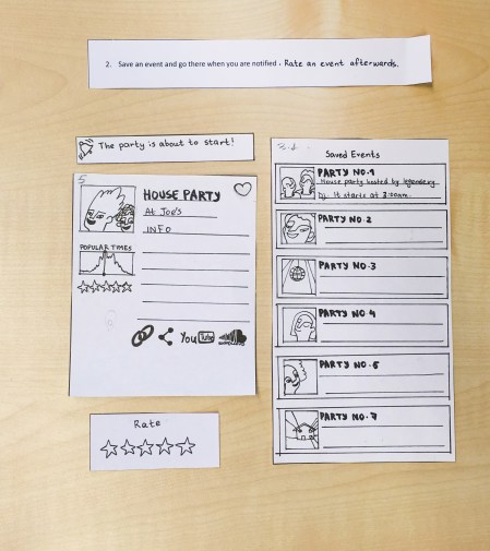
Test No.3:
Changed testing tasks:
-
2)Save an event and go there when you are notified. Rate an event afterward.
-
3)By using a “Crew Finding” app feature, register your new crew and find its members on a map.
Issues:
- It was not clear in Task 2 which event the user had to save.
- The user could not find the way to escape a current screen.
Test No.4:
Changed testing tasks:
- 2) Save a chosen event (House Party) and go there when you are notified. Rate it afterward.
Issues:
- There was a confusion with the “Date” button - the user could not find a use.
- The user wishes to have an additional map on the party information screen.
Summary:
Most common issues:
- Search button was a preferred choice for the most users.
- The “Menu” bar was missing or was not clear for the first two users.
- Users interacted differently with the paper prototype than they would digitally.

Leave a Comment